_
PT
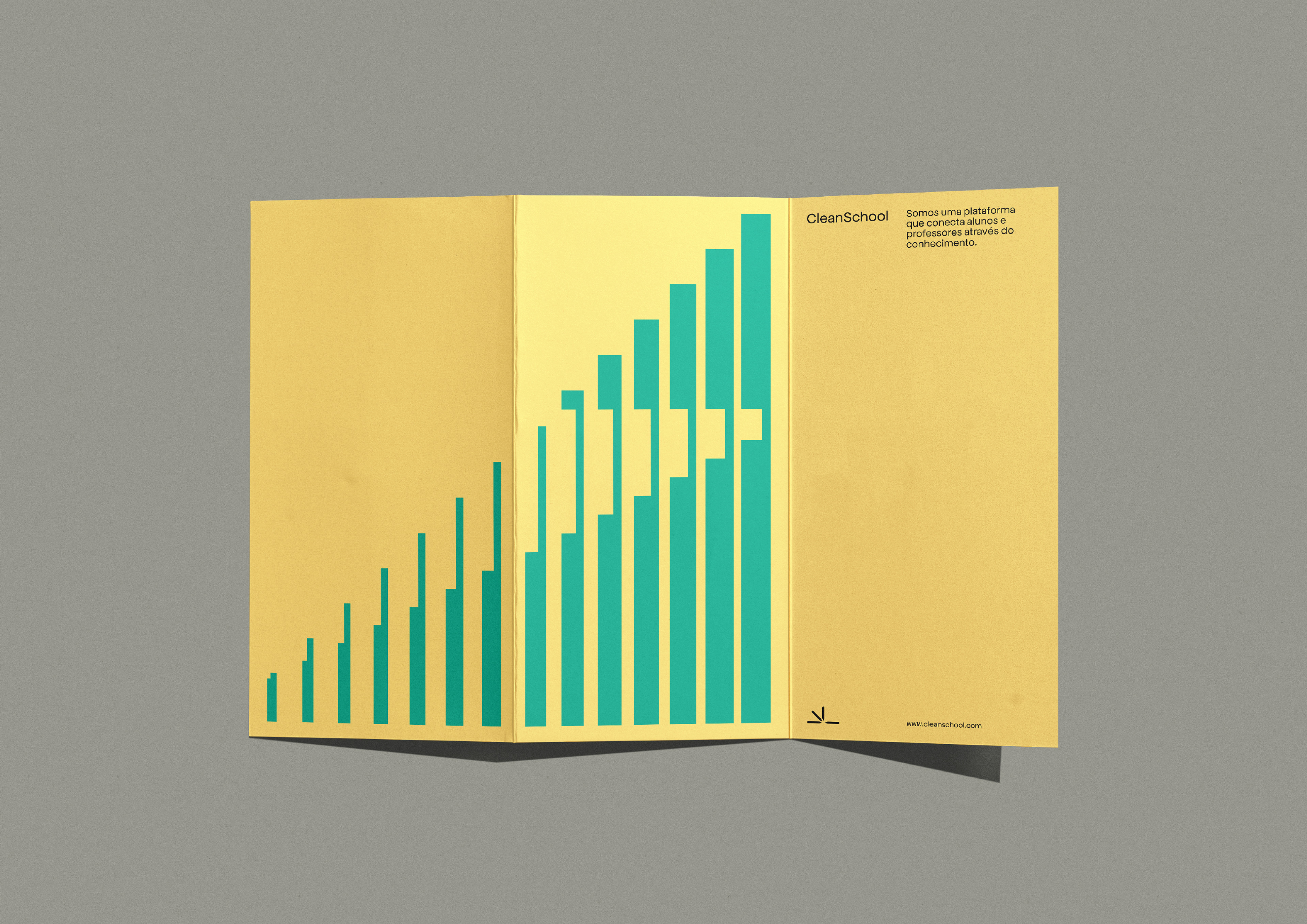
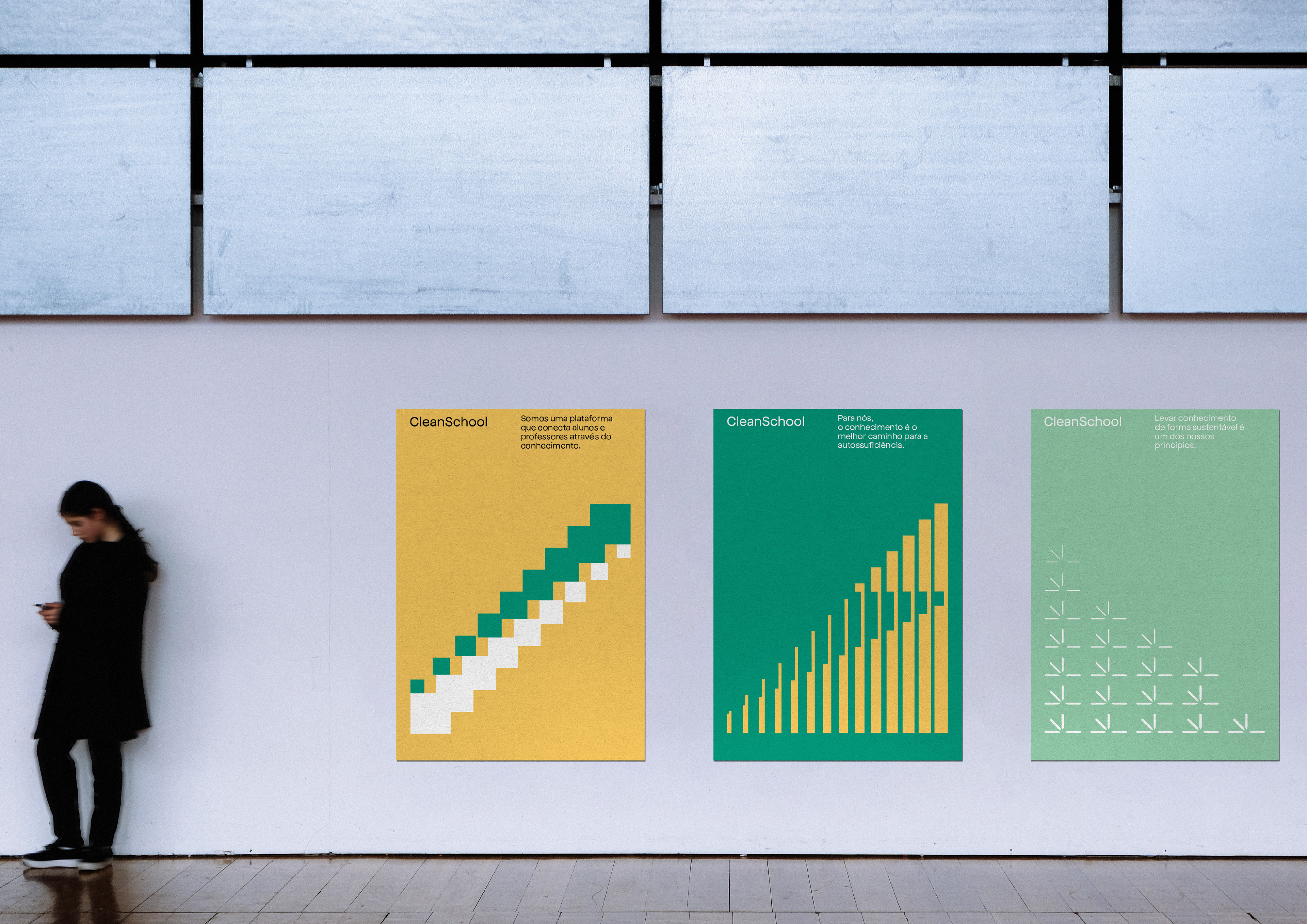
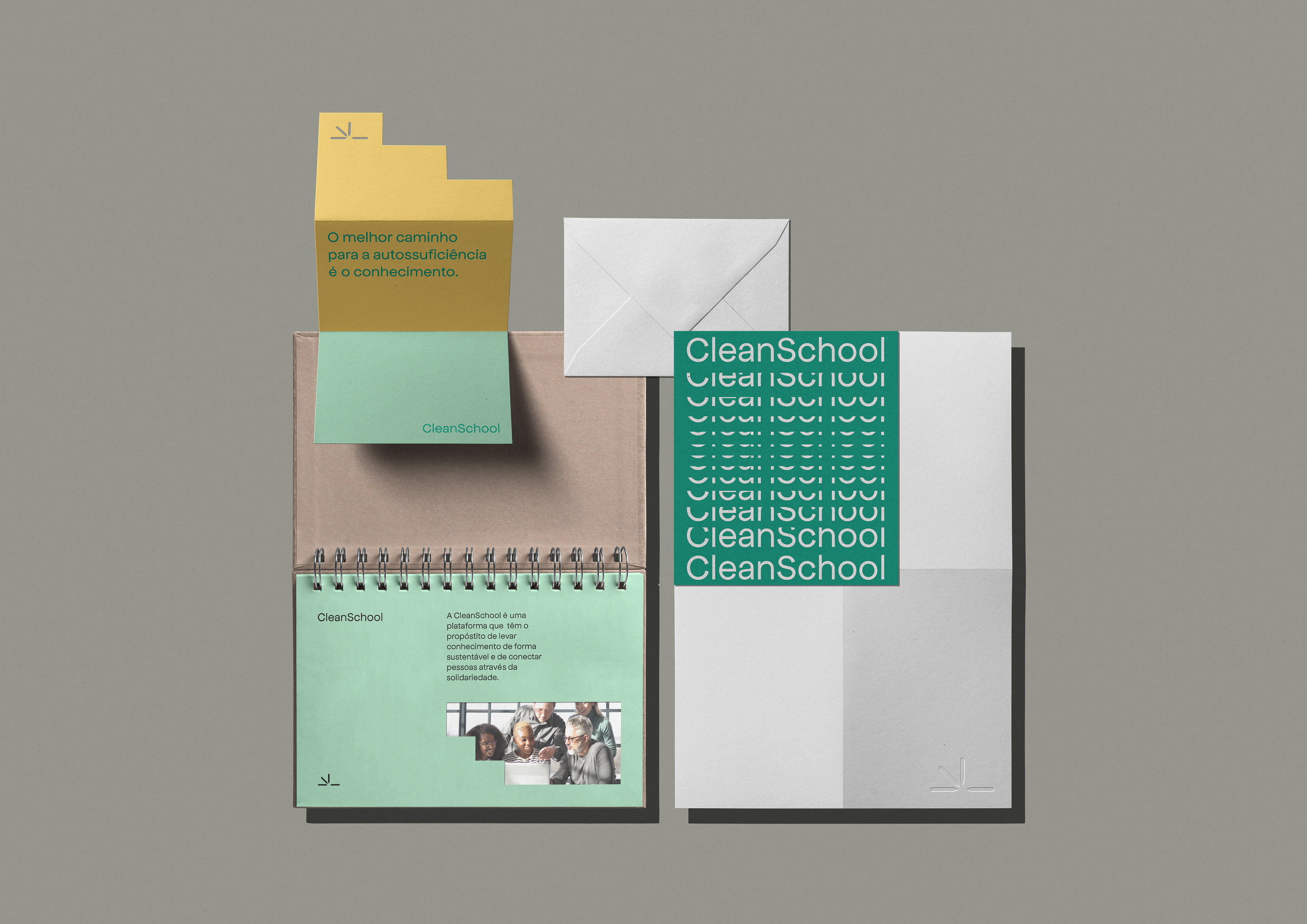
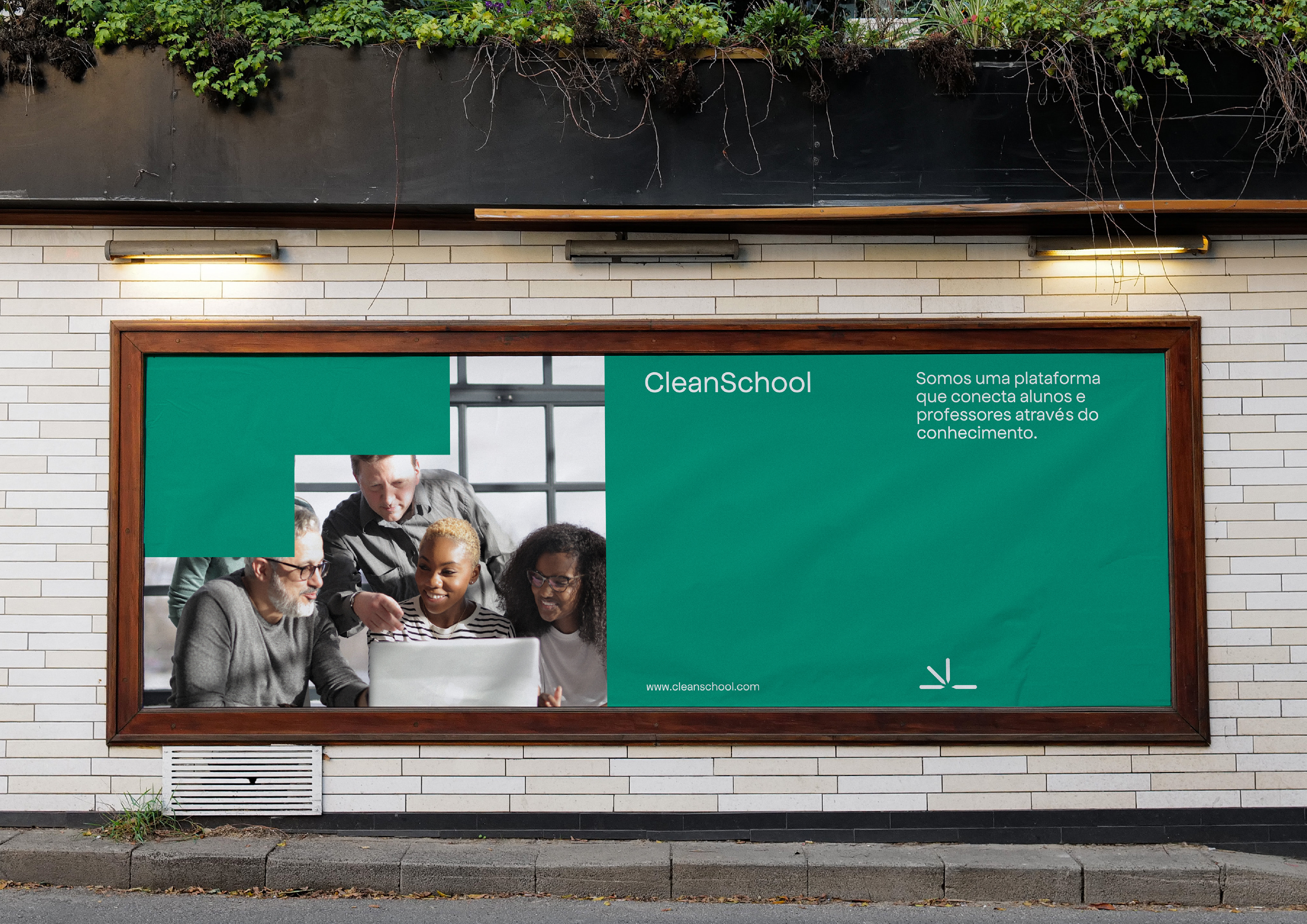
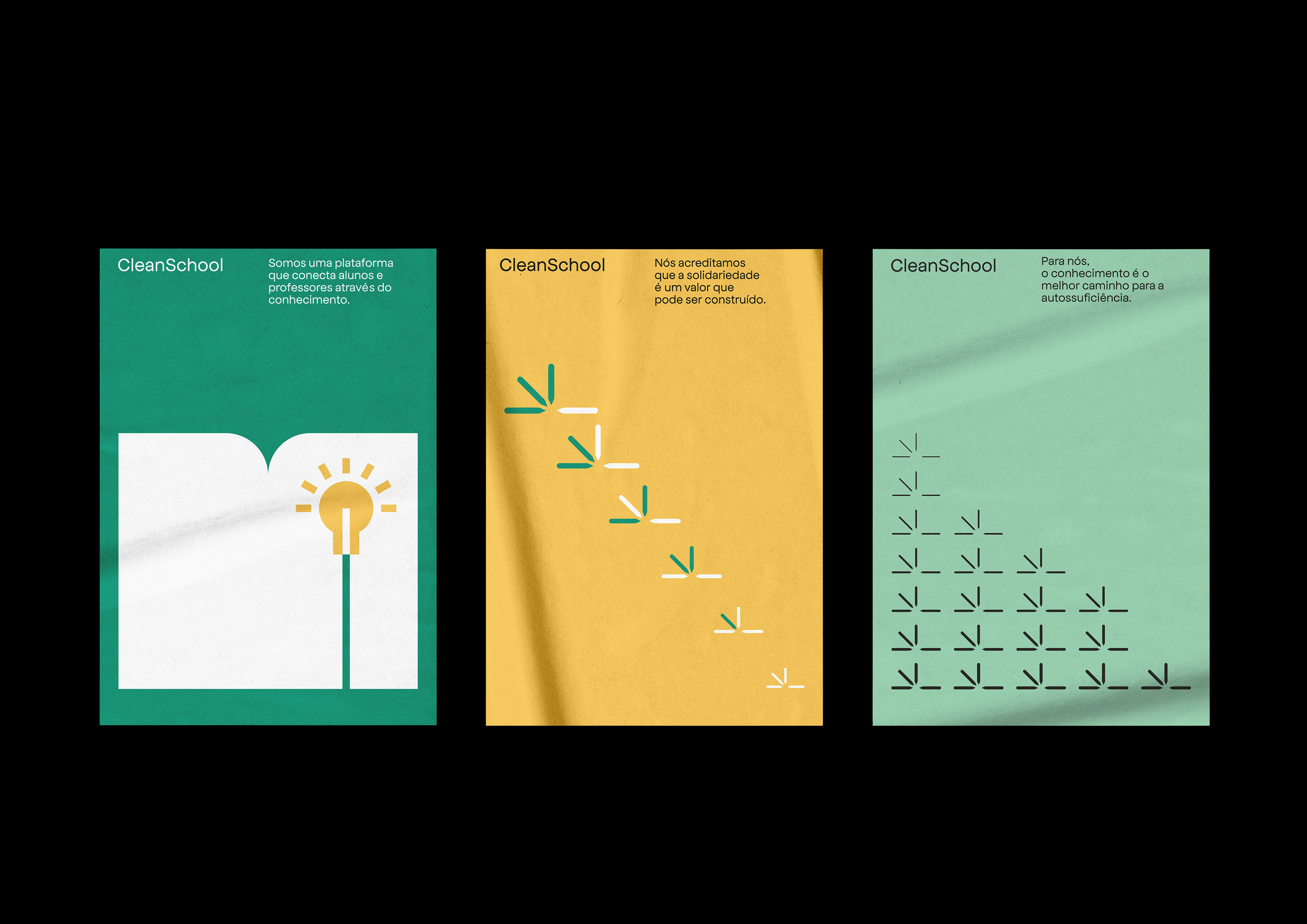
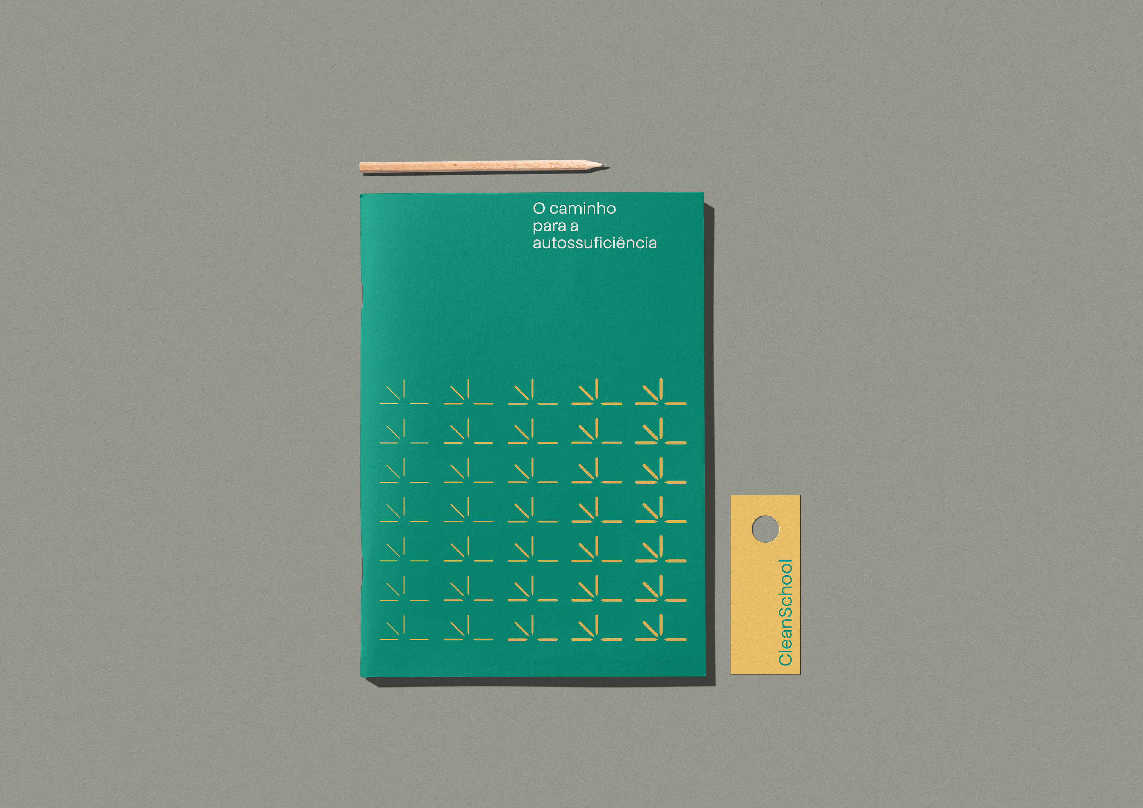
A Clean School é uma plataforma de ensino online que pretende levar conhecimento de forma clara, acessível, direta e descomplicada. A identidade foi inspirada no design gráfico modernista da década de 60/70 que era tinha como objetivo tornar o design mais legível e de fácil entendimento. A base da criação do logotipo foram as formas geométricas e tipografia simples na intenção de criar uma identidade limpa.
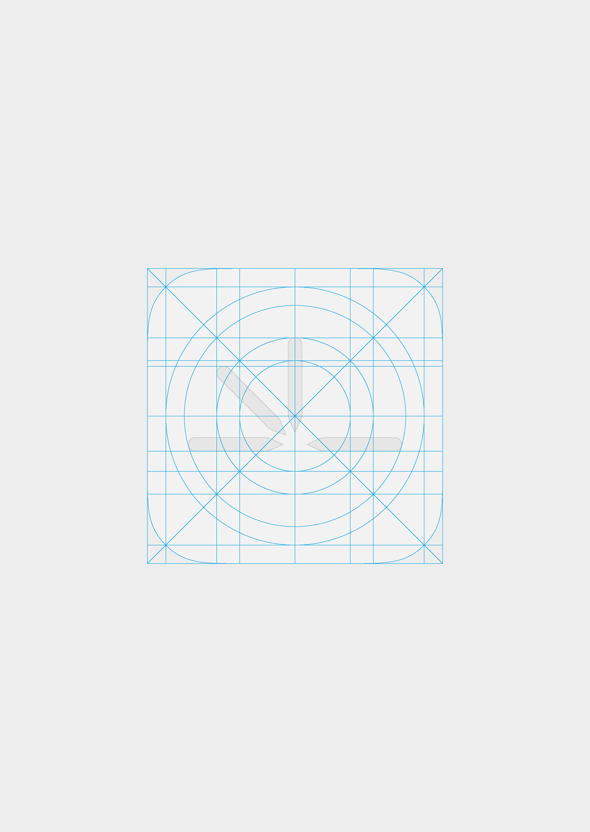
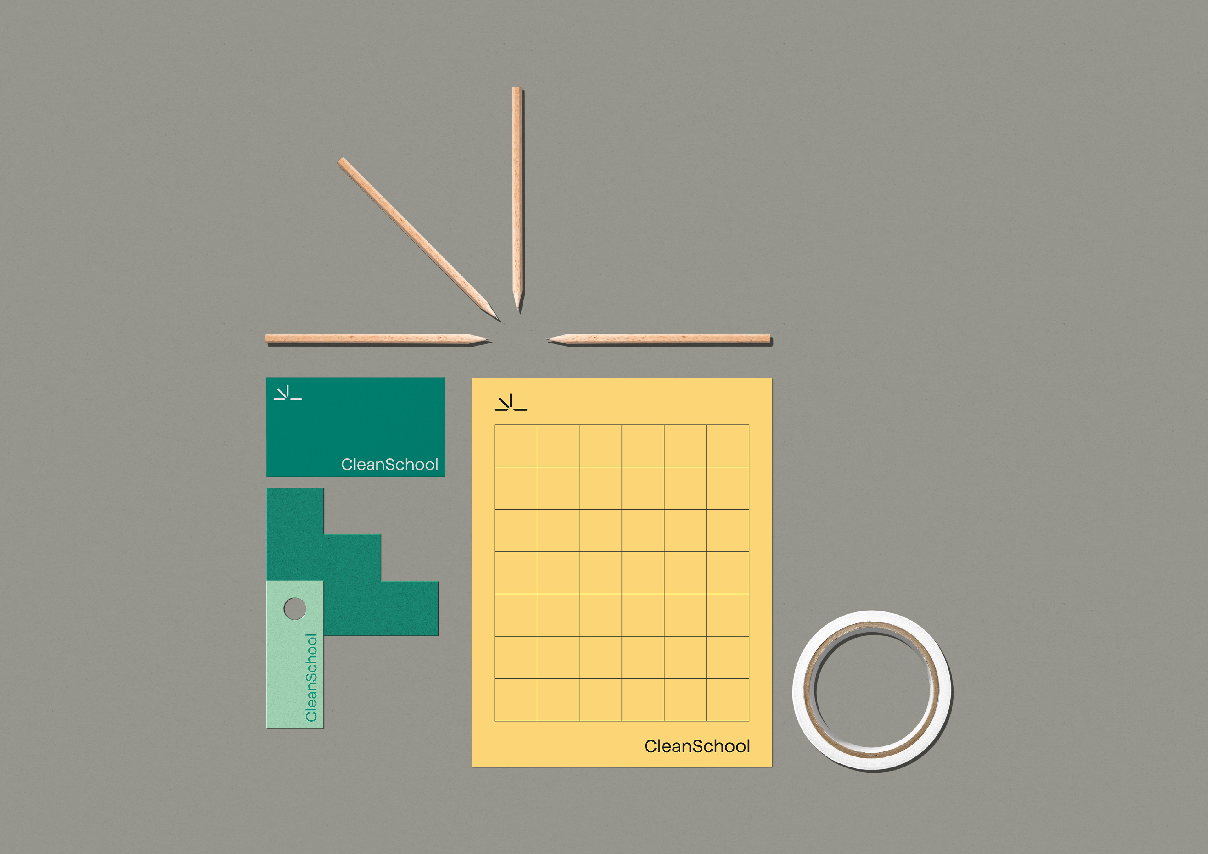
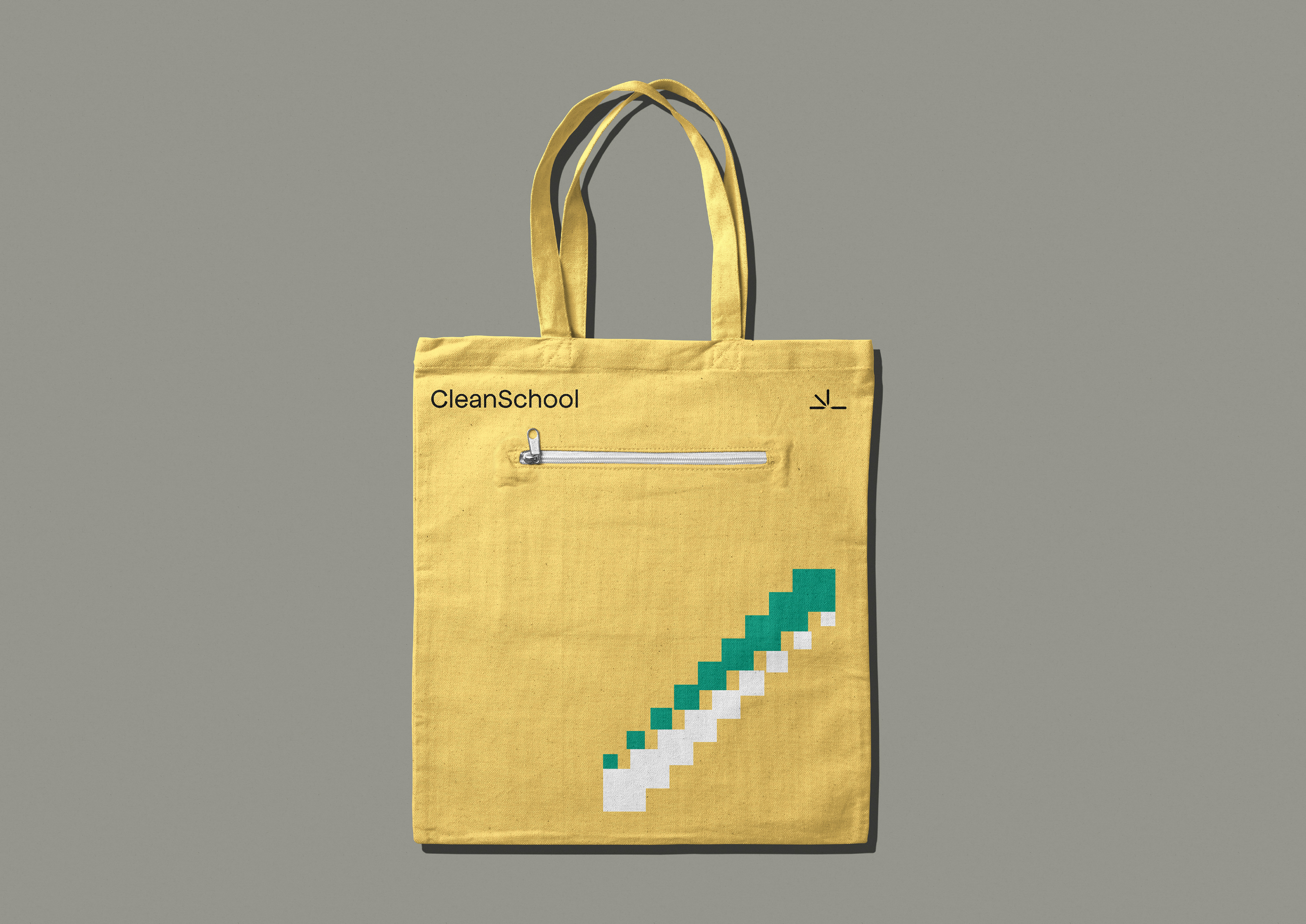
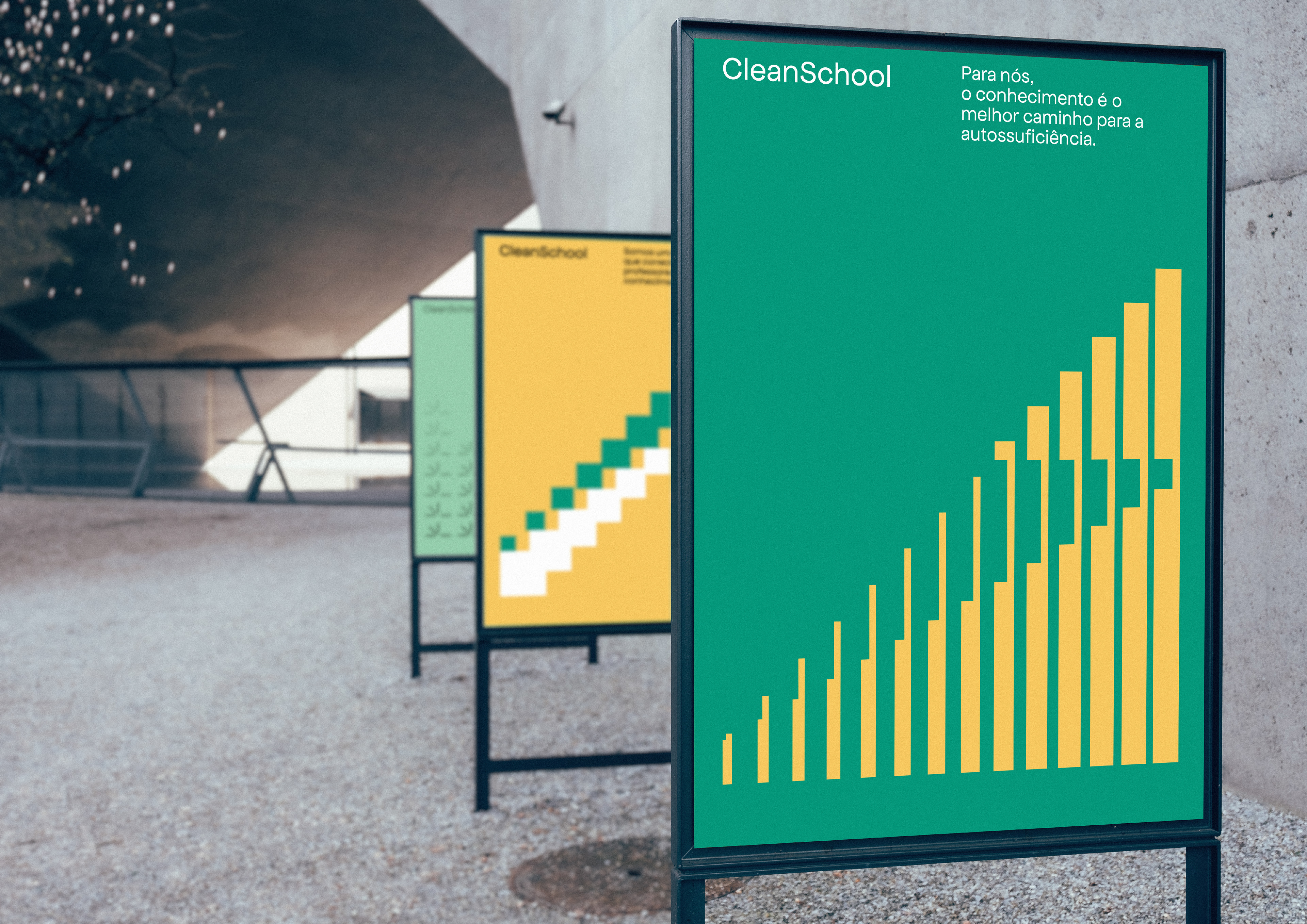
A construção do símbolo teve como ponto de partida o círculo, uma das formas geométricas mais simples existentes, ele serviu de pano de fundo para a criação do logotipo, assim como o lápis, elemento que simboliza o ensino. No símbolo final, os quatro lápis representam os principais valores e missões da marca; A Solidariedade, a Autossuficiência, a Liberdade e a Igualdade.
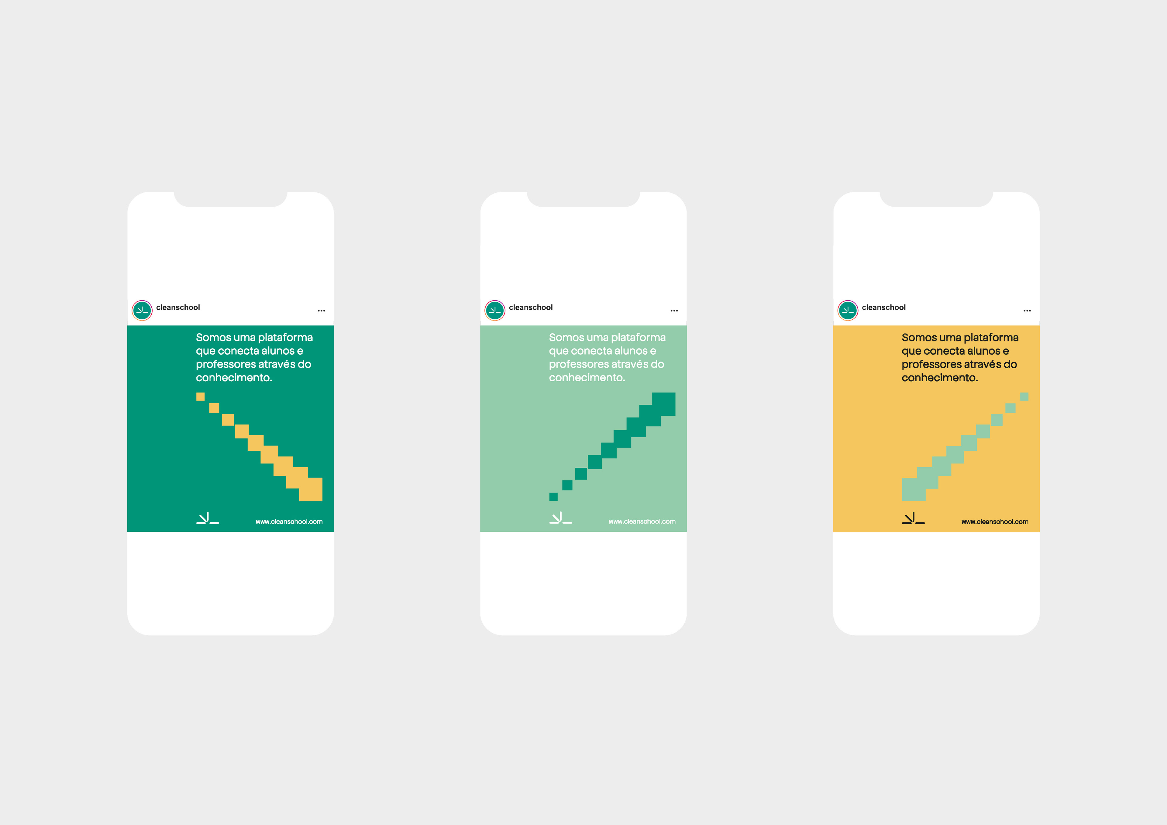
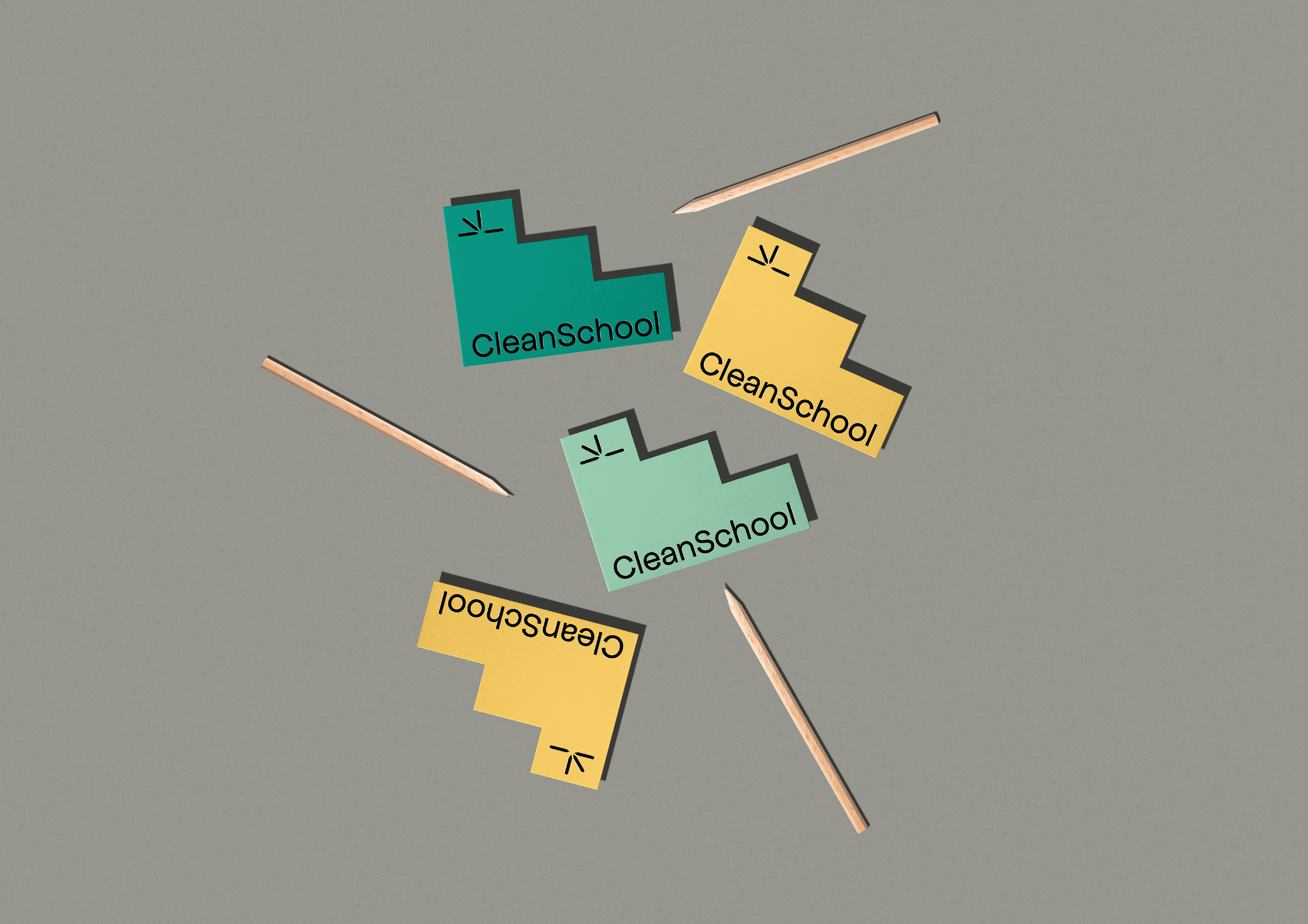
Assim como visto na animação, o logotipo é dinâmico, ele ainda simboliza o aprendizado, através do livro sendo folheado e a solidariedade e conexão entre professores e alunos com a união dos quatro lápis. Além de todos esses conceitos, mais um elemento foi usado nos desdobramentos e grafismos de apoio da identidade; a escada, ela representa a progressão em direção ao conhecimento.
_
EN
Clean School is an online teaching platform that aims to bring knowledge in a clear, accessible, direct and uncomplicated way. The identity was inspired by the modernist graphic design from the 60's and 70's that was intended to make the design more readable and easy to understand. The basis for creating the logo was as geometric shapes and simple typography in order to create a clean identity. The construction of the symbol had as its starting point the circle, one of the most simple geometric shapes, it served as a backdrop for the creation of the logo, as well as the pencil, an element that symbolizes teaching. In the final symbol, the four pencils represent the main values and missions of the brand; Solidarity, Self-Reliance, Freedom and Equality. As seen in the animation, the logo is dynamic, it still symbolizes learning, through the book being leafed through and solidarity and connection between teachers and students with the union of the four pencils. In addition to all these concepts, one more element was used throughout the brand identity; the ladder, it represents the progression towards knowledge.
_